Magic Kingdom Maps Galore!
Magic Kingdom maps can be considered the first promotional vehicles for the Florida property. Until the Disney Decade, Disney had always struggled with promoting Walt Disney World. With Disneyland, the country was ripe for Walt’s vision of a family-inspired theme park. The nascent television industry was a perfect way to broadcast the ideas behind Disneyland into millions of homes. By the time July 17, 1955 rolled around, pretty much everyone in America (and a lot of the rest of the world) knew what to expect with Walt’s Magical Kingdom.
Walt Disney World was a different idea altogether. Marketed as the Vacation Kingdom of the World, Disney spent time trying to show people the scope and size of the resort, while still making it feel like a family destination. Most of the early PR focused as much on the recreational activities, like tennis, boating and horseback, as well as the Magic Kingdom itself. Let’s take a look at how Disney presented the park to guests through various Magic Kingdom maps over the years.
The Complete Edition About Walt Disney World
This is from the cover of The Complete Edition About Walt Disney World, a magazine-style report released in 1969 and includes an illustration of one of the early models of the Magic Kingdom. You can see a lot of familiar landmarks in the drawing. It’s not really a Magic Kingdom map but it is one of the first images released with the park layout.
The Preview Edition
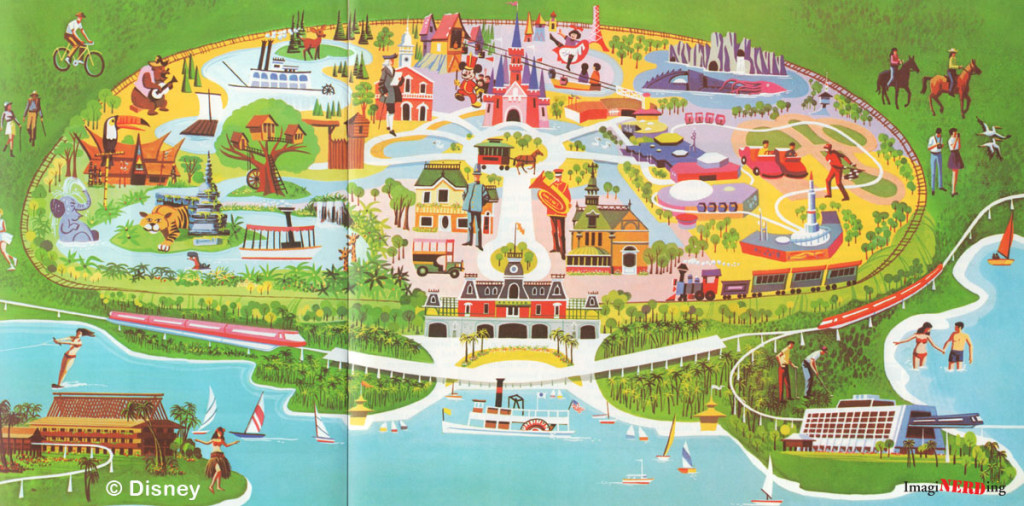
This Magic Kingdom map is from the Preview Edition that was sold in the Preview Center. It was one of the first published views of what could be expected in October, 1971. The full map only shows the Magic Kingdom, the two hotels and a plethora of recreational activities. It’s pretty accurate, sort of.
The Story of Walt Disney World (1971 – 1975)
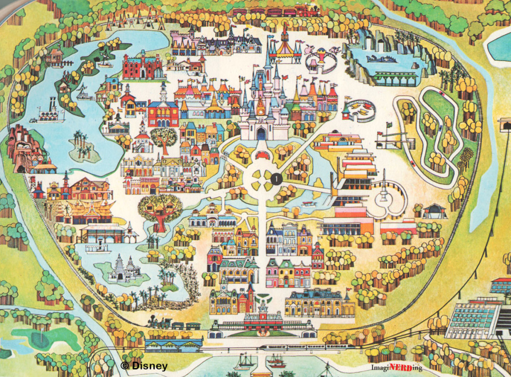
A closeup of the Magic Kingdom section of the map from the 1971 Story of Walt Disney World. This was also the map that appeared in the guest rooms of the Contemporary and Polynesian Resorts. It’s looking more like the Magic Kingdom, but there are still some differences. You can see the show building for the proposed Western River Expedition in Frontierland. Did you know that the yellow building in the bottom right corner of Main St was supposed to be a hotel?
- You can read about the map here.
GAF Guide to Walt Disney World
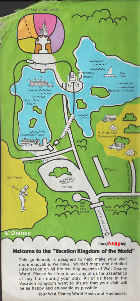
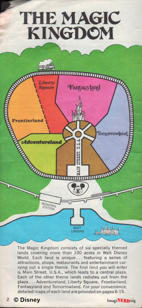
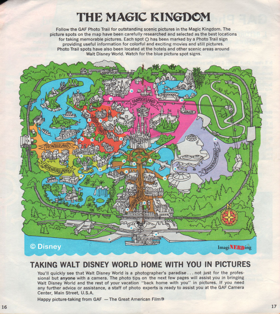
The next three scans are all from a 1971 GAF Guide to Walt Disney World. The GAF Guides were small booklets that listed each and every attraction, as well as restaurants and stores.
This is one of the first images in the guidebook that refers to the entire property. Notice the STOLPort? The Magic Kingdom is oversized and references only the major divisions of the park.
The above image is an overview of the Magic Kingdom. Is the dashed line simply to delineate the two sections dedicated to America? Any other thoughts? I also love that the “official” font is used for each land.
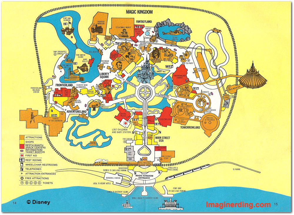
The closeup of the Magic Kingdom is one of the first detailed and semi-accurate Magic Kingdom maps released. It’s not perfect, but it is pretty close to what you will find. All of the blue dots? Those are GAF sponsored Picture Spots. Eventually, they became the Kodak Picture Spots. Then some were transformed into Nikon Picture Spots.
Your Guide to Walt Disney World (1974)
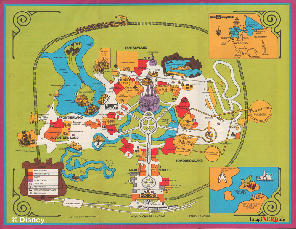
This map is from the 1974 Your Guide to Walt Disney World, a small, fold-out one sheet. What is really unique about the map is how the show buildings, shops and restaurants are presented. It is a fairly accurate scale drawing. You get a feel for how the building connects and how much space they actually encompass. There is also a very small arrow that shows you where the attraction entrance is. It’s a very non-artistic styled representation and seems almost clinical.
The Story of Walt Disney World (1976 and up)
The 1976 edition of the Story of Walt Disney World updates the map and we see more of a cartoon version of the Magic Kingdom. The entire map is more iconic and the biggest attractions are promoted.
Your Guide to Walt Disney World (1978)
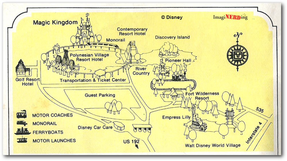
The 1978 Your Guide to Walt Disney World (below) offers two views that are as different as any other set of Magic Kingdom maps with each other. The first one is a very stylized view of the entire resort with a single icon to represent the individual areas. Notice how large the parking lot is and that it is centrally located?
The second map from the 1978 guide is similar to the one from 1974 but with a few additions.
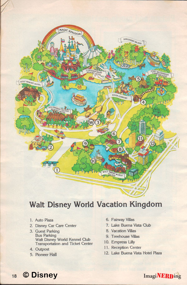
Walt Disney World Magazine (1978)
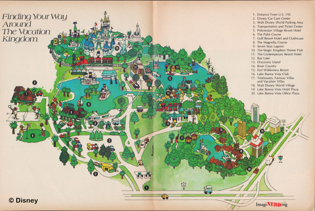
The map above is from a 1978 magazine-style PR piece. It follows the same caricatured style that we have seen in the later part of the 1970s and we can see the Village Marketplace, Village Resort and the Lake Buena Vista Hotels. I have to admit that I love the purple Haunted Mansion and the giraffe peaking out from the Jungle Cruise.
GAF Guide (1979)
The GAF Guide was another publication presented to guide you in the Magic Kingdom and to help you take better pictures. It is interesting to see the map of the Magic Kingdom to go back to the different colored segments of the park based on the land.
So, it’s all rainbows over the Magic Kingdom? We still see most of the same ideas presented, but just in a smaller size.
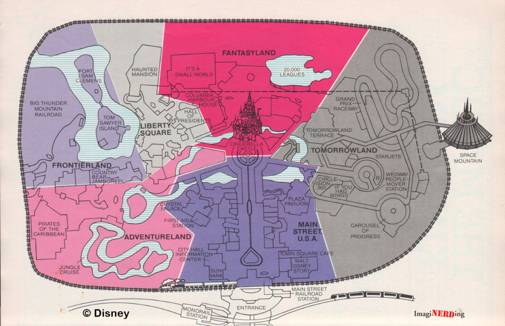
Birnbaum’s Official Guide to Walt Disney World (1984)
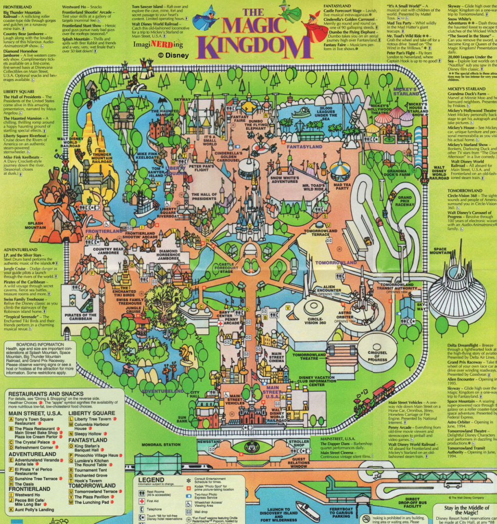
This is from the second Official Guidebook. It still uses the color codes for the lands, but only the attractions are highlighted. You still get an idea for the physical size of the buildings. It is still pretty boring but gets the job done.
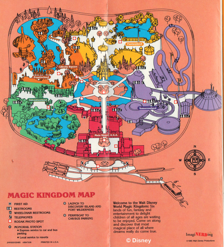
Kodak Guidemap 1985
This map from Kodak takes us back to the 1971 GAF and the Story of Walt Disney World Magic Kingdom maps. Stylistically, it is very similar and we start to lose the footprint of the building in favor of the architectural flavor of the land. Notice how Tomorrowland is still rather clinical and the other lands seem to be more stylistic? And we get more of the Kodak Photo Spots!
Kodak Guidemap 1993
This is a larger fold-out map that is larger than 11X17. More detail is offered, including a majority of the actual show building facades. It still looks like the 1985 and 1971 maps.
Kodak Guidemap 2006
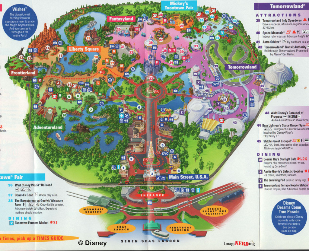
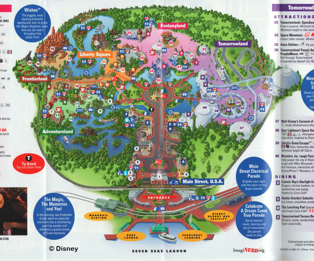
Around 1999, we started seeing the map that we use today. The same map appeared in the Official Guidebook and on the Internet. It’s closer to an aerial view of the Magic Kingdom with fairly accurate representations of the buildings and the lands. A lot of the cast member and behind-the-scenes areas are covered with trees.
Kodak Guidemap (2011)
Not much of a change in the the 2011 map. We’ve lost Toontown, of course, and it just gets covered up with trees. What is interesting is what was on the back of this special map from October 1, 2011.
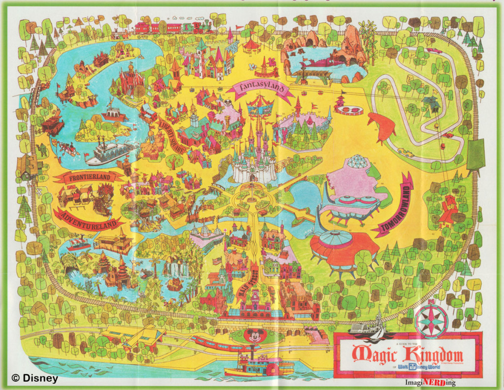
40th Anniversary Map
This reproduction was on the back of the guidemap that was handed out on the 40th Anniversary of Walt Disney World. It’s a closer mix between the Preview Edition map and the one from the 1971 Story of Walt Disney World map. Of course, it was fun to use the map to ride the opening day attractions.

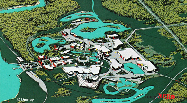
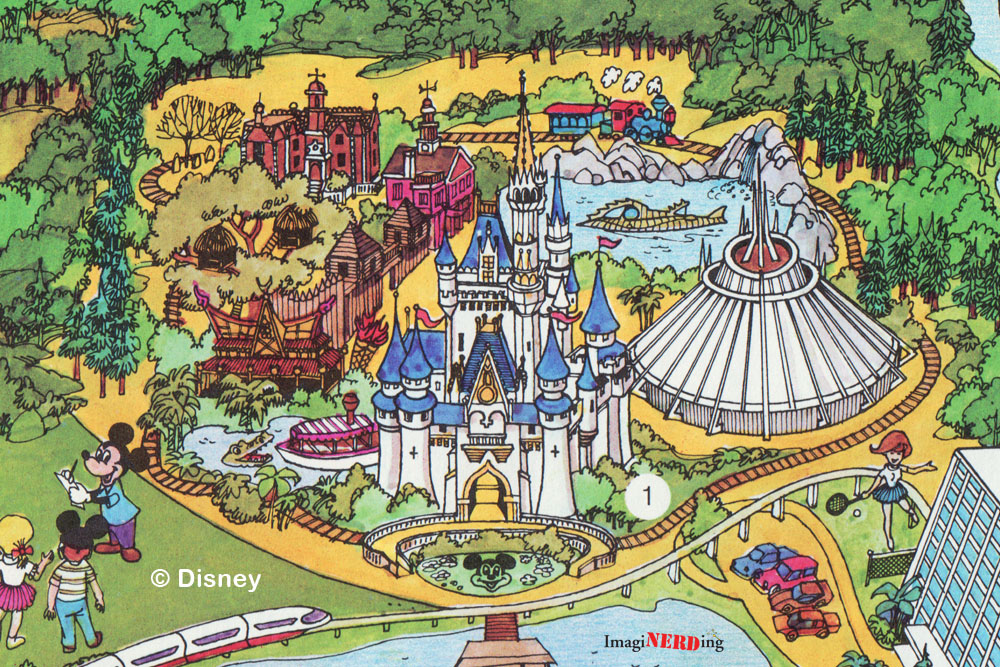
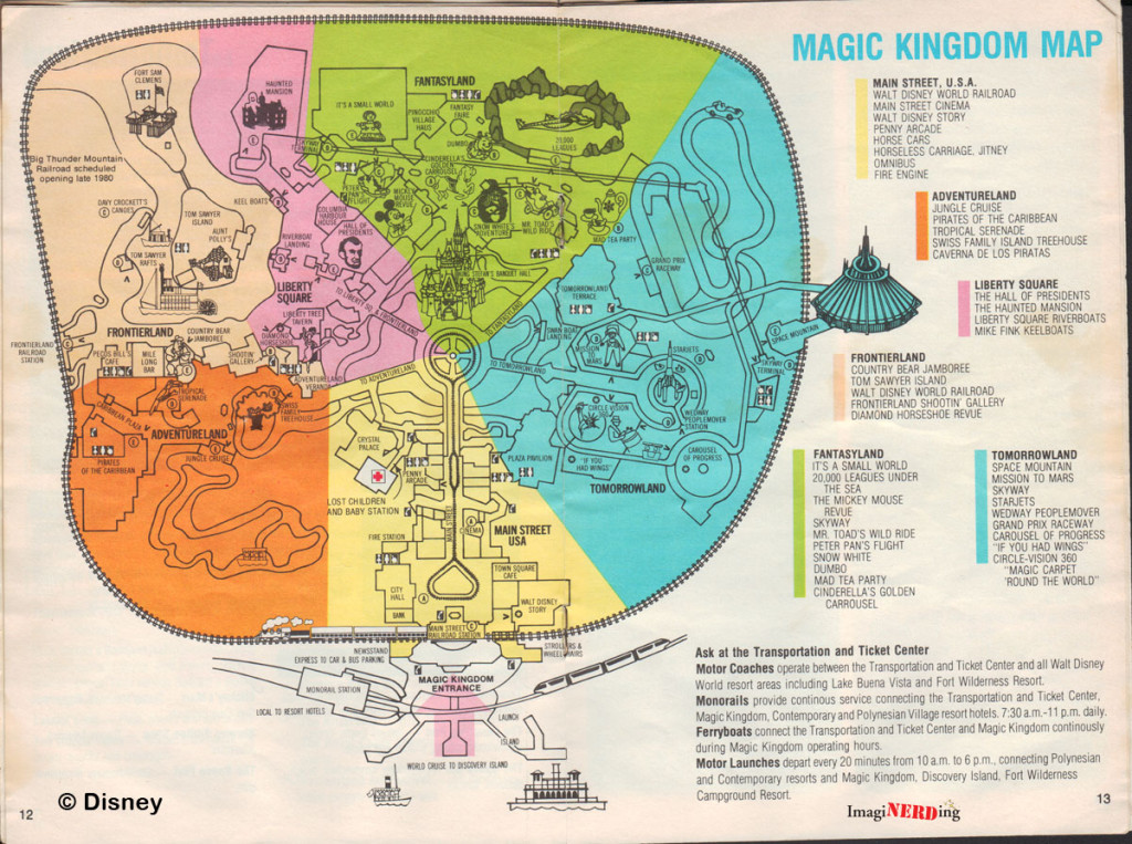
Interesting look of Tomorrowland in The Complete Edition About Walt Disney World map. Notice the polygonal footprint of Space Mountain and all of the water under the Autopia. I guess they didn’thave it finalized and expected it to be like Disneyland’s